


![Rachel Eyre - Asda - Chief Customer and Digital Officer[99].jpg](https://d53bpfpeyyyn7.cloudfront.net/Pictures/274x183/7/9/0/3127790_racheleyreasdachiefcustomeranddigitalofficer99.jpg_263815_crop.jpeg)


How does the Retail Week Awards shortlist stack up for this year’s Best New Store? John Ryan reports.
Choosing the best new store from a list of wildly differing retailers is never an easy task, and this year the job facing the Retail Week Awards judging panel is harder than ever.
Ahead of the wrangling, however, here is a look at the runners and riders in this year’s awards category, which will be judged at Retail Week Live on March 8.
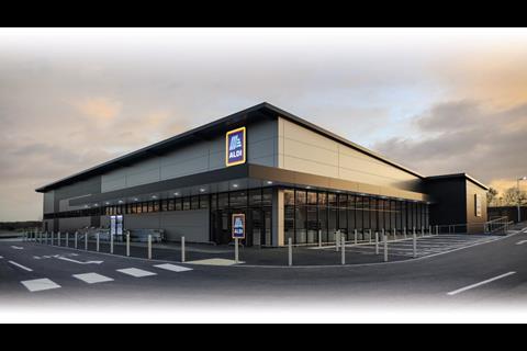
Aldi, Glascote, Staffordshire
The Aldi outpost in Glascote is the retailer’s concept store to spearhead its Project Fresh initiative. As such, circulation space has been increased at the front of the store, with greater prominence being afforded to ‘fresh’.
“Other new elements include product-focused lighting, bolder category signage and a POS package promoting Aldi’s commitment to British sourcing”
Other new elements include product-focused lighting, bolder category signage and a POS package promoting Aldi’s commitment to British sourcing. Overall, the new design has a more open and premium feel.
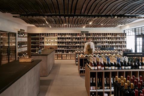
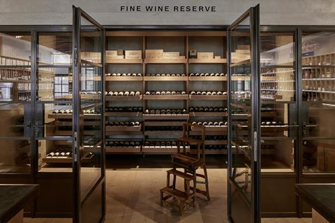
Berry Bros & Rudd with Cumberland Group, London
A name that has been synonymous with selling fine wines relocated to new premises last year and revealed a space that is an exercise in fine living and a democratic approach in equal measure.
With a ceiling made from deconstructed Bordeaux wine barrels and tasting notes on the wooden mid-floor display units, this one makes choosing your poison a pleasure.
And if you want to splash the cash, there is a discrete fine wine room at the back of the shop.

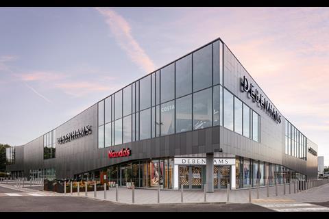
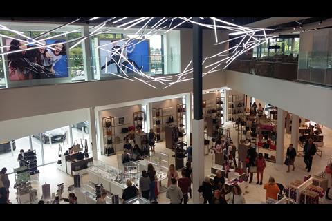
Debenhams, Roaring Meg Retail Park, Stevenage
At a moment when the department store sector is under intense pressure, opening a new-look Debenhams must be a brave move.
This two-floor store dispenses with walls and walkways in the mid-shop, allowing shoppers to explore the space in a less regimented manner.
“There is less stock on the floor, making circulation more straightforward and enhancing sightlines across the space”
There is also less stock on the floor, making circulation more straightforward and enhancing sightlines across the space. Note should also be made of the dramatic atrium and the coloured neon-tube installations.
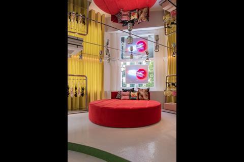
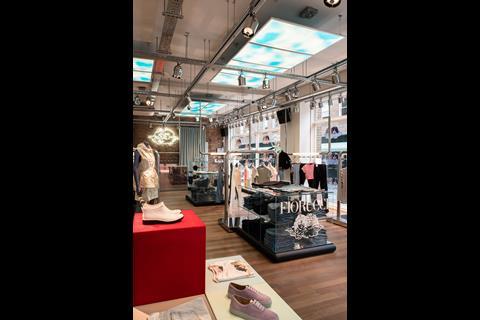
Fiorucci, Soho
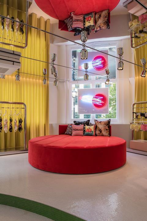
1970s brand icon Fiorucci emerges into the limelight once more with a two-floor store in the heart of Soho.
This is camp kitsch writ large with a personalisation area lit by white neon signage and a circular sofa in bright red: not for the fashion-timid.
Attention to 70s detail is one of the store’s hallmarks, with lighting last seen in shop windows of the period and suspended chrome display fixtures.
All this and the twin cherub logo, which is everywhere across the store.
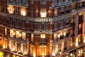
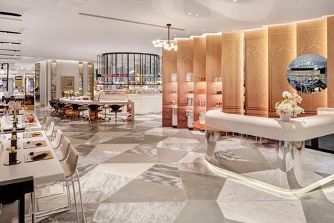
Harvey Nichols with Virgile & Partners, Portview and Dula, Knightsbridge
A project spanning the whole of a very large ground floor in a luxury department store is a serious undertaking.
Incorporating beauty, accessories and fine jewellery, the aim of this makeover is to increase shopper dwell time and to offer a range of services, particularly in the beauty area.
The redesign removed pre-existing structural walls to create a brighter, free-flowing space with a more boutique-like feel. The floor was also made distinctive through the deployment of a range of materials, from marble tiles to concrete slabs.
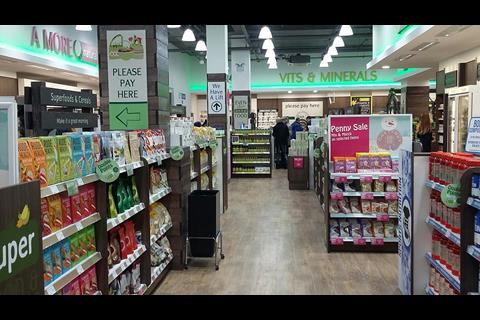
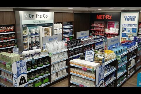
Holland & Barrett, Oxford Street
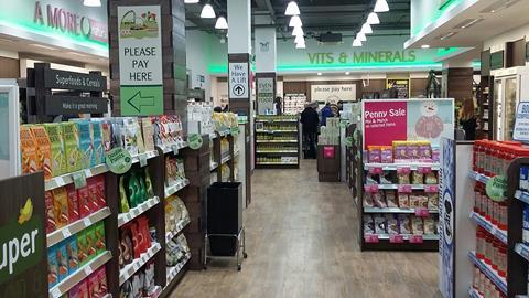
Holland & Barrett’s health-and-beauty flagship is a pleasure to shop as well as being worthy.
This is a deep store with an upper perimeter washed by green neon light, taking the eye around departments from Vits & Minerals to A More Natural Beauty.
The whole has more glamour about it than is normal in the sector and beauty shoppers are as likely to feel at home as the tofu and muesli crowd.
Downstairs, there is a substantial sports and nutrition area.
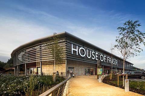
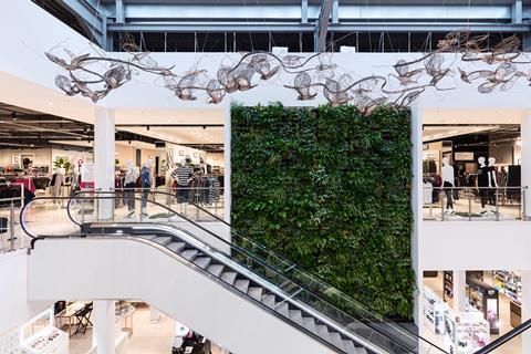
House of Fraser with Kinnersley Kent Design, Concept Design, Rushden Lakes
A new House of Fraser is always an event, if only because of the scale of the endeavour involved.
The Rushden Lakes store in Northamptonshire, however, is more worthy of comment for the slick manner in which it embraces ‘industrial big box’ retail architecture, while at the same time being relevant to its location and ‘green’.
From a ‘living wall’ formed of 2,000 local plants to an exposed open ceiling, this store is both landmark and anchor for a new shopping destination.
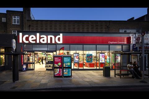
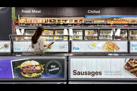
Iceland with Whippet, Clapham Common
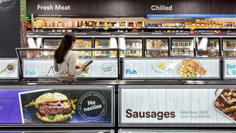
The perception of Iceland as chest-freezer-land is laid to rest by its new Clapham Common branch.
Externally, the store has a bigger, bolder logo set against red wood with digital screens in the window.
Within, a line is drawn between ‘fresh’ and ‘frozen’, with a graphics package aimed at countering the idea that ‘Iceland doesn’t do fresh’.
There is even an ice-cream freezer that plays an ice-cream-van tune each time it is opened.
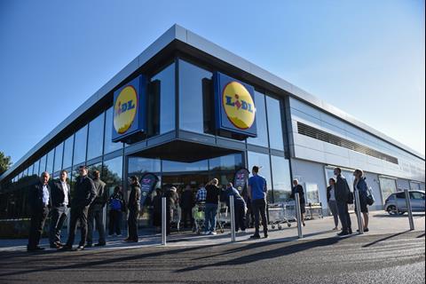
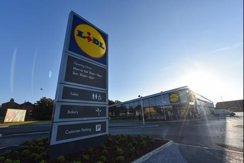
Lidl, Station Road, Mirfield
The days of discount grocers with boxes on palettes and half-empty cardboard boxes used as display units are increasingly a thing of the past, and the Lidl store in Mirfield shows how far things have progressed.
“Its CO2 emissions are also 20% lower than comparable buildings”
This revamp (the retailer has traded for 19 years from this location) boasts, among other things, an in-store bakery, longer-style tills with dual packing and a fully glass-fronted façade that maximises natural daylight.
Its CO2 emissions are also 20% lower than comparable buildings.
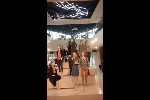
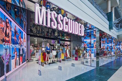
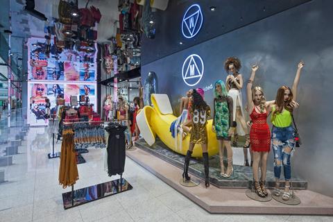
Missguided, Bluewater
The second standalone store from the online retailer is loud, flash and brash, making it exactly what is required for its young fashion customer.
The store takes its physical cue from the virtual shop, and much of what is on view is a reflection of the brand’s online personality.
All of which means a space with sassy mannequins, text-message-style graphics in pink neon and a lot of mirrors. In terms of giving the shopper what she wants, this store sets a high standard.


No comments yet