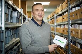
Nick Baum, client services director at AdConnection, shares his view of good and bad sites.
Good site: Frenchconnection.com
This site offers its customers an entirely different and enhanced digital experience by successfully merging online with the high street. High-quality photography and illustrations feature throughout the site and serve to highlight current trends of the season. The simple six-stage navigation panel is user-friendly and the site features a number of consumer-minded sections. The social corner is first rate with links to all social media platforms and a blog with strong celebrity endorsement. This is an emotionally evocative site that draws in the user by telling an excellent brand story throughout.
Bad site: Karenmillen.com
Karen Millen’s site lacks the visual appeal of French Connection, and the opening page feels quite bland.
The online magazine in the ‘KM Uncovered’ section includes some high-quality photography but it is tricky to navigate. The site is also lacking an interactive section for users to engage with the brand. There is a good blog but unfortunately it isn’t featured on the home page and is tucked away in the Uncovered section. On a positive note, the personal styling section drives in-store footfall, harmonising online and high street. But ultimately the site fails to tell a brand story and lacks personality.
No comments yet