


Selfridges' online debut
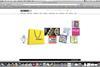
Selfridges’ much-anticipated transactional website finally went live last week.
Already have an account? Sign in here
Selfridges’ much-anticipated transactional website finally went live last week.
Already have an account? Sign in here