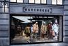
With a brand overhaul and a London flagship redesign, Warehouse aims to reclaim its go-to status on the fashion shopping circuit.

Remember Warehouse? It used to be on the list for women in search of metropolitan fashion and then, for whatever reason, it wasn’t any more. It still had stores but it was no longer a routine go-to for shoppers. Something had to be done.

Now it has been; and for those wishing to get a sense of what it means, visit the flagship on Argyll Street in central London. This has been a flagship for almost as long as Warehouse has been around so when the decision to rebrand and reposition was taken, it was always going to be the focus.

In the hub of a fashion destination

Argyll Street is a stone’s throw from Oxford Street and even has an Oxford Circus tube exit on its length. Warehouse is directly across this pedestrianised street from sister retailer Oasis’ flagship. This means this should be fashion central and equally there should be a steady flow of fashionistas passing Warehouse, perhaps on their way to Liberty at the far end of the street.

This small Warehouse store now punches above its weight in terms of grabbing the gaze, largely thanks to the translucent, internally-lit ceiling rafts that take the eye into the interior of this 2,700 sq ft, two-floor shop.

Warehouse worked with design consultancy Checkland Kindleysides, alongside Warehouse brand consultant and Hunter creative director Alasdhair Willis, to remodel the store to provide “a modern take on our collections”, according to customer director Kate Walmsley. She joined Warehouse in June having previously been digital director at Topshop.

“In the past few years the city woman has been given a lot more choice and is now looking for something that is a bit different and which has a point of view”

Warehouse customer director Kate Walmsley

There are mannequins in the window, of course, and they do help to set the scene, but it is the muted light from the panels that does most of the work. This is a distinctly urban store design and is a complete contrast from the floral, feminine feel of Oasis across the street. It has concrete flooring, white-tiled feature walls with black grouting and black, theatre-style spotlights on gantries to provide accent lighting for the stock.

The ground floor perimeter is home to a polished scaffolding-like rail system, predominantly for hanging merchandise. The mid-shop features freestanding single rails where the emphasis is not on volume but on allowing the shopper to view the product in an uncluttered setting.

On its own this would risk falling into that stark school of minimalism that can leave shoppers feeling not entirely welcome, but a couple of elements mitigate this.

Yellow adds dynamic to granite palette

The first is the use of yellow, a sharp highlight colour to lift the black, greys and whites that form the bulk of the palette. Yellow is sparingly used on parts of the mid-shop rails and to define the route at the back of the shop that leads to the staircase to the basement.

Then there is a large digital screen showing fashion videos. The long, illuminated ceiling rafts that stretch away towards the rear demand that the big screen in the stairwell, visible through a glass balustrade, is looked at. While this sort of element is relatively commonplace in fashion retailers these days, in this store there’s a sense that it belongs. It’s part of the blueprint instead of having been layered on after the design was complete.

Walmsley says: “It feels lighter and brighter. The use of the screens that we’ve incorporated here creates something really distinct and British.” She adds that this is a store for the city woman, someone who “in the past few years has been given a lot more choice and is now looking for something that is a bit different and which has a point of view”.

On the wall to the left of the screen there is a galvanized metal roller shutter. This doesn’t actually open, but it helps foster the quasi-industrial feel to this interior.

Downstairs, the floor footprint is much larger and the original positioning of the staircase has been moved from the middle, the major structural part of the refit, so that it does not dominate.

The stairwell screen still commands attention from across the floor and, as on the upper level, there are more translucent ceiling rafts, tiled accent walls and another roller shutter. Owing to the lack of windows, the factory feel is intensified.

The question is whether this is sufficiently different to get shoppers through the door time and again.

Moving on from youth fashion

Walmsley says that Warehouse caters for the shopper who might have frequented River Island, Topshop and the like back in her day and who, having now moved on, wants to retain a sense of fashion.

This is the first store to receive the revamp. Walmlsey says: “We want to see what works. But there are some key partnerships [retailers in which Warehouse has a presence] and we’re looking at ways in which we can incorporate elements there, as well as bringing this to new and refitted stores.”

Reinventing a brand is never easy and taking something about which shoppers probably already have an opinion and changing minds is probably one of the harder tasks that any retailer can undertake.

This then is not a clean slate, but rather a reinterpretation of what was already there and therefore really does merit the much-overused term “repositioning”. If Warehouse can take much of what has been done in this location and export it across a large part of its store portfolio, then it will have a fighting chance of regaining that high street niche that it once called its own. More importantly, it will be once more be high on the list for the fashion crowd.

Warehouse, Argyll Street

Reopened
September 12, 2016

Size
251 sq m

Number of floors
2

Design
Checkland Kindleysides and Warehouse brand consultant Alasdhair Willis

Lighting
Fagerhult

Ambience
Modern urban factory

Warehouse established
1976