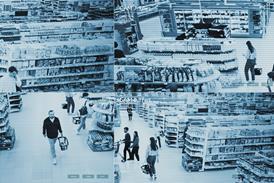
The Co-operative is under pressure but is working hard to improve its fortunes. Will its new format store help?

Euan Sutherland, the former chief executive of the Co-operative Group, said last week that one of the reasons for his shock departure was the organisation was “ungovernable”.

And there is perhaps a sense that this is a retail proposition that operates somewhat along the lines of early medieval England. This was a time when fiefdoms were ruled by freewheeling barons who didn’t always do as the king said. And so its goes with the Co-op.

The Co-operative food, Old Street

Opened January 2014, one of 13 of the type

Store type Generation 2 fresh format

Ambience Artisanal

Reason for visiting ‘Convenience’ and ‘meal solutions’

The questions that need to be asked about its stores are how could they be better and what is the retailer doing to make this happen? Equally, will it be adopted across the country?

One answer is to be found just along the road from the Retail Week office, on Old Street in east London. Here, the Co-op has a new-look convenience store that, on the face of it, should have broad appeal to the legions of office and design and technology workers who flood into the area on a daily basis.

Stand in front of the store’s long frontage and the message is positive. This is a store that’s open from “6am to midnight” from Monday to Saturday and which trades for the permitted six hours on a Sunday. The shop is convenient as far as trading hours are concerned.

To get an expert view, Giles Brookes and Andy Smith from Twelve Studio, which works with, among others, Sainsbury’s on its store design, joined the tour. Brookes, a senior partner at the the design consultancy, notes there is also a vaguely warm feeling about the Co-op: “You want to like it, because of what it stands for.” He cautions however: “Unfortunately, the idea of the Co-op is often stronger than the reality.”

A place to chill

Looking into the store from the front door, the first thing that is obvious is the bread. French sticks, bagels, pretzels and cakes, all displayed on a few pieces of wood and metal equipment. This is a curious break from the normal convenience store scheme of things in which ‘fresh’ tends to be towards the front of the shop.

In this branch, however, it is ‘meal solutions’ at the front with fresh towards the back. This is a layout that bears comparison with Aldi or Lidl, according to Smith, creative director at Twelve Studio.

But the Co-op is not a German hard discounter and the fixtures and fittings are of the kind that, in parts, wouldn’t look out of place in a Little Waitrose. Money has obviously been spent on creating the kind of interior that will have broad appeal to the relatively affluent shopper in a hurry.

The other point about this store is that it is a place to chill.

In the window there are wooden stools where shoppers can relax and stare out at the traffic on Old Street while enjoying a cup of coffee from the in-store Costa Coffee machine that forms part of the left-hand-perimeter wall at the front of the shop.

But before reaching it shoppers will come across the freestanding time-of-day unit.

On the morning of visiting, at around 10am, it was set up for breakfast. There were a few small bottles of fruit juice and some yoghurts and muesli on show. To the right of this were curry flavour Pot Noodles and immediately to the right of this again, still on the same unit and under a second notice that read “Don’t forget THE EXTRAS”, there were packs of Tilda and Uncle Ben’s rice.

This didn’t appear to be normal breakfast fodder and might have been better off at some point further along the shopper journey.

Brookes pointed out the upper portion of the perimeter, which is green, runs around the whole of the shop and features a mass of printed messages.

These are clearly intended to be inspirational with phrases such as “Farm to fork”, “You’ve got great taste”, “Creative cuisine” and “A plateful of great ideas”. Yet as Brookes observed: “You’re only going to be in here for a short time, so it’s hard to take everything in. This looks very, very busy and there doesn’t even appear to be any kind of decompression zone at the front of the store.”

Chilli confusion

Colour pictures of food have been placed in front of the perimeter frieze. These, presumably, are intended to put shoppers in the mood for meal preparation, but perhaps putting the words”Chilli Con Carne” above a chiller unit where sandwiches and fizzy drinks were displayed might be thought wayward. Mention should also be made of the hot food unit, which was more than 75% empty.

It was the same story further into the shop. Here the ‘fresh’ produce was merchandised on well-lit (with LEDs) perimeter units, above which were pictures of beef stroganoff, lemon chicken thighs and chicken curry. All looked good, but bore little relation to the product categories that were beneath them.

At the back of the shop, the Wine & Beer section featured a very good selection of chilled beers and white wines - perfect for the time-pressured shopper who needs a cool glass with the evening meal.

“It’s nice to have a measure of organised chaos, as long as there is a sense of being organised”

Giles Brookes, Twelve Studio

Sadly, confusion reigned elsewhere, with a picture of chicken stir fry above the cereals in the ambient goods area. There were also ‘deal’ gondolas that advertised “a good deal for you” and then put a rice cooker, mid-price wine and chocolate eggs side by side. As Brookes remarked: “It’s actually quite nice to have a measure of organised chaos about a shop from time to time, as long as there is a sense of it being organised.”

At the checkouts, a sign announced that the “self-checkouts do not accept cash”, which is not convenient, and on the wall behind the manned tills there was multiple messaging and a screen that wasn’t working.

On the way out of the store, a block of Amazon collection lockers is certainly useful for office workers.

Andrew Mann, customer director at the Co-op, said: “The shop you see in Old Street is a really good example of how the Co-op is changing. We’ve put the customer at the heart of the business. We’ve always been relatively customer-focused, but in the past we operated shrunken supermarkets - this store is about giving customers what they want.”

Ungovernable store

This is a store that has very considerable aesthetic appeal, but which is, ultimately, confusing and where the shopper is likely to happen upon things, rather than being able to navigate the space effectively.

It is clear that much effort has been expended on creating an interior that has an almost artisan-like feel about it, but on the matter of making it shoppable, this felt “ungovernable”.

If the Co-op is to find its way again, it needs to be thinking about more than creating a store that looks nice. The barons in other parts of the Co-op would do well to question the efficacy of the Old Street model.