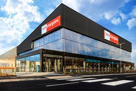
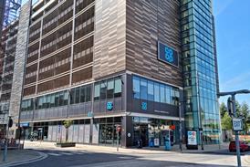
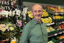
Sainsbury’s has continually evolved store design without losing focus. Retail Week speaks to the grocer’s head of retail design.

If there’s a word that can’t be applied to the UK supermarket panorama it is ‘dull’. Price wars, new formats, strategic alliances, new product areas – they all feature in one form or another across the market. Yet there is a sense that this is a sector that is in the commercial doldrums at best and in the view of many may actually be in very choppy waters indeed.

Sainsbury’s store design

Strategy: Incremental change in-store

Execution: Format and rapid roll-out

Store design: In-house and Twelve Studio

New store ambience: In touch with their locations

For Sainsbury’s, the wind of change has been blowing strongly, but positively. It is about to see the coronation of new chief executive Mike Coupe, has sealed a deal with Danish retailer Dansk Supermarked to relaunch discounter Netto in the UK in 2015, and has certainly not been above joining the in-store race for value.

There is, however, another element. One of the reasons that it is frequently held up as an example of the way to go is the manner in which it has dealt with store design. And here there is a word that could readily be applied to what it has been doing – ‘consistent’.

The old store design adage that the best interiors are about ‘evolution rather than revolution’ is writ large at Sainsbury’s.

Even allowing for this, there is as much change in the way the stores look as there are alterations in the make up of the board at the moment. This is an organisation that understands that in-store design change should be constant but, at the same time, it should not be a cause for concern.

Ongoing evolution

Damien Culkin, Sainsbury’s head of retail design, puts the case for what is being done clearly: “Design has been an ongoing evolution over the last five years. Historically we did have a slightly different operating model. We would build milestone stores at specific moments in time. This meant we didn’t have many of them and the rest of the estate didn’t always reflect what was happening.

“An increasingly varied estate has meant that today we have to focus on formats and roll-outs in a way that we might not have done in the past.”

He cites the use of high street units that might not have been purpose-built for food retailing as one of the reasons for this change. “There are a lot of convenience stores appearing in [properties that were] pubs, banks or non-food stores, which have demanded an increasingly formatted approach.”

Culkin makes the point that a bakery department being installed in a new store would be displayed in different ways depending on the type of shop. There are stores that have a very large footprint, such King’s Lynn, opened at the end of 2013, or very small outlets such as Cobham in Surrey, which represented a format departure for the retailer last year. Both are Sainsbury’s stores, but each has a rather different requirement as far as how products are displayed.

At the same time, both have to be recognisably from the same stable. Meeting this demand has meant a fairly strict regime in terms of method and Sainsbury’s has worked long-term with consultancy Twelve Studio.

The design pyramid

Culkin says that there is a four-element store design pyramid at Sainsbury’s. At the bottom of the pyramid are design principles, while above sits a framework that means that they can be “delivered consistently” in new stores.

Then there is the matter of what goes into a store – the customer journey, as embodied by layout, navigation and mood graphics. Finally, layered on top of all this, there is the identity, which is perhaps the most obvious manifestation as far as the customer is concerned and could perhaps be interpreted as what makes Sainsbury’s Sainsbury’s.

“An increasingly varied estate has meant that today we have to focus on formats and roll-outs in a way that we might not have done in the past.”

Damien Culkin, Sainsbury’s head of retail design

Of late, the latter point has been subject to subtle change thanks to ‘Project Orange’. This is an initiative in which Sainsbury’s has worked with design consultancy Landau to bring back the “warmth” to its identity and to make things “less slabby” in relation to the fonts used in stores and online.

Evidence of this can be seen at the Bradway Road Sainsbury’s Local store in Sheffield. Culkin says that this will be taken more generally across the estate in an attempt to reclaim orange for Sainsbury’s as a key element of its identity. And the fact that it will be spread across all formats and store types gives it what he refers to as “cognitive miserliness”. Translated, this means making things easier and simpler for the shopper – over-complexity can lead to confusion.

All of which does make it sound as if Sainsbury’s is about monolithic design decisions taken centrally and then cascaded down across the organisation. It’s an impression that Culkin is quick to scotch: “People need reference points for a particular store. What are the location points that people remember and how can we help them with this?”

In effect, it means that while there will be a general template for a store of a specific size, it also means that there should be enough flexibility in a store blueprint for it to be made local in terms of graphics that will jog shoppers’ memories. The Wandsworth store, a large footprint branch, is a case in point with a graphic detailing the course of the River Wandle and the buildings along its banks that runs across the front of the store.

There is also the matter of the somewhat contradictory impulse that has shoppers looking for the traditional, in the shape of in-store market-style environments, while at the same time wanting digital elements such as scanning using a phone and digital wallets.

Culkin says that where “people see tech in other parts of their lives, we seek to have something similar in our stores”. It is not a case of playing catch-up therefore, but more an example of keeping pace with the digital and design zeitgeist.

Stores in fine fettle

So ultimately, what does it all mean? For Sainsbury’s, in spite of a diverse property portfolio, there is an instantly recognisable handwriting, but one that has been subject to almost continual change.

And the design train keeps running. This week brought the refurbishment of the branch at the south end of London’s Totttenham Court Road to completion. It is, in effect, a (very) large convenience store, not unlike the Brixton branch that opened towards the end of 2013.

Given its high profile location, the Tottenham Court Road store was probably more than due for a makeover.

That said, it is symptomatic of the approach taken that what has emerged is different from what it replaces, but still feels like Sainsbury’s.

This is a hard act to pull off. Yet as Justin King prepares to hang up his bag for life, the spirit of design change and evolution at this seems to be in fine fettle. No doubt some look on at how it manages things with envy.