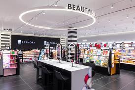
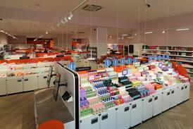
Asking shoppers to ‘take another look’ and then getting them to love the Superdrug brand is what the refurbished Wimbledon store is trying to achieve. John Ryan reports

If you’ve got more than 900 stores, 3,800 sq ft might not sound like a lot of space employed to make a fresh start. But you do have to start somewhere. That is certainly the case with health, beauty and convenience retailer Superdrug, which has just opened a new-look store in Wimbledon’s Centre Court shopping centre that, should it prove successful, will be rolled out to 100 more stores this year.

At first you might think the reason that commercial director Steve Jebson and property director Nigel Duxbury have chosen to trial the store in the affluent south London suburb is because it’s just down the road from the head office, in Wallington. To an extent this may be true, but Jebson says the principle reason for choosing the store is that it is, or rather was, an absolutely “normal” Superdrug branch.

Since last Thursday, however, it is anything but and walking along Centre Court’s lower level, it is immediately apparent that this is the case. For starters, the familiar predominantly pink, black and silver frontage has been replaced by a rather more stripped-down colour scheme that more or less does away with the pink and emphasizes the black. It is likely though that you may not even notice this as the first thing the eye really alights upon is a small TV monitor that is set into the window-line.

Room to breathe

David Dalziel, creative director at Dalziel & Pow, the consultancy that has worked to create this interior, says: “What we’ve done is to put long-term graphics [in the window], which can be changed every couple of months, behind a moving element.” Jebson says as part of the retailer’s strategy of asking shoppers to “take another look” this store is clearer and less cluttered than the traditional Superdrug store and the window is a reflection of this.

Step through one of the two adjacent entrances and what is immediately obvious is that you can see through to the back of the shop. This is in sharp contrast to other branches in the chain, where tall gondolas are crammed into the available space, lending the stores a semi-supermarket ambiance.

In Wimbledon, by contrast, there is something almost akin to a continental pharmacy, not least because it is all white, other than the ‘pharmacy’ at the back of the store (which you can see from the front), which is, naturally, a lurid green. Also obvious is that this is a store of two parts. On the left-hand side, there is a beauty department, while the message on one of the overhead ceiling supports states that the right-hand side is for ‘essentials’ - for which read price-driven value basics.

“We were looking a bit tired and felt that we needed a bit of a refresh,” says Jebson. The brief given to the designers was to create a store environment that would appeal to the fashion-conscious shopper. “The customer shopping here is also shopping in River Island and Topshop,” says Dalziel. “This gives it a bit of energy.” Jebson adds: “This is a beauty store that has departments, it’s almost like a department store.”

Freshen up

Whatever your view is of what has been done, it is clear this is an altogether different proposition from a standard Superdrug. The last time anything was tried on this scale by the retailer was in Uxbridge in the middle years of the last decade, when what emerged was a very frosted pink and black confection, which didn’t appear to capture the hearts of shoppers at the time.

It is also probably worth noting that while some of the categories on sale may be similar to those offered by rival Boots, this is not a value-led Boots wannabe. Instead, the combination of dark wooden floorboards (which turn out, on examination, to be vinyl, but at this end of the market, still looks the part), white lights and clear, bright graphics, gives the store a very fresh feel and one that does not make you feel as if you are being guided around a racetrack.

Starting with the beauty area therefore, the space is divided between brand and own-brand. There is nothing shouty about this iteration of the Superdrug brand and the point of sale is about emphasising mood rather than brand name. The graphics on the walls are also divided between names such as Rimmel and Maybelline and the in-house products, with all of the latter forming the value offer. Unlike anywhere else, no special treatment is afforded to the branded merchandise. It is displayed within precisely the same context as the own-brand merchandise.

The neutral Superdrug envelope that has been created allows the brands room to breathe, but does not permit them to dominate. There is also a desire for the own brand to really make its mark: “We want you to love our own brand as much as we do” runs as a message on one of the mid-shop gondolas.

Towards the back of the shop, there is the shop-in-shop perfume area, where brands reign supreme. Superdrug’s parent, AS Watson, actually owns The Perfume Shop and the shelving that has been used in this rear left-hand corner of the shop reflects this parentage. This, however, is a Superdrug perfume shop, although Jebson says The Perfume Shop implants are to be found across the chain, as, in a handful of stores, are ‘3’ mobile phone areas. (3 is owned by AS Watson’s ultimate parent, Hutchison.)

Store facts

Store Superdrug, Wimbledon

Location Centre Court shopping centre, Wimbledon, lower level

Design Dalziel & Pow

Size 3,800 sq ft

Design emphasis Putting fashion into beauty retailing

Roll-out potential Money is earmarked for 100 more stores of this kind this year

Superdrug owner AS Watson

Bag the essentials

Moving from the perfume area to drugs, the transition is made to the store’s pharmacy counter. Like Boots, this store comes equipped with a consultation room, but the light vinyl wood that is used to form an overhead canopy and the white pendant lights over the counter, give this a more jaunty and less clinical aspect than its Nottingham-based rival’s equivalent.

And, finally, it’s the essentials area. This is where deodorants, razors, creams and suchlike are for sale and the only thing that can be said about the offer is that if you are short of basics for the bathroom cabinet, then you’ll find what you need here.

As in the beauty space, this part of the shop features relatively dense merchandising on low gondolas that allow uninterrupted views from front to back, punctuated by red value messages.

Towards the front door there is the cashdesk. This is the only part of the shop where the brand is really overt, with a huge pink Superdrug logo set against a white background. There is plenty of space around it and the inevitable queuing system features the usual chocolate impulse merchandise and essentials for male grooming. The latter is located there to make it easy for men to find what they want. “We haven’t always been that good at this,” comments Jebson.

This is a good-looking store and you’ve got to hope that it finds favour with local shoppers, because if anything similar can be replicated elsewhere, this stands a fighting chance of doing well for Superdrug.