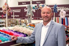
Dunelm’s seven-year-old Milton Keynes branch has been revamped. John Ryan visits and assesses what has changed.

Last week Dunelm unveiled its preliminary results for the year to July 1st. Sales rose by 8.5%, but pre-tax profit fell 15.2% to £109.3m.

During this period Dunelm acquired online operation Worldstores, which had substantial trading losses, and also invested in its store portfolio.

The store investment impetus is clear in Milton Keynes, where a Dunelm branch has been in place since 2010.

I last visited this branch in February 2014, and it isn’t unfair to say that while the offer in the store was substantial, the environment was outmoded and unlikely to be of interest.

Dunelm, Milton Keynes

Dunelm, Milton Keynes

The gable outline of the Dunelm logo is repeated on both floors as a display trope

Since last October however, much has changed. The first thing of note is the logo has had a makeover. Once known as a “Dunelm mill”, now it is simply “Dunelm”, with the outline a house surrounding the last two letters.

Simplicity is key

The interior is simpler as well. Before the previous store layout was dense and confusing. While there are still a lot of products on display, finding your way around is now much more straightforward.

There is also more natural light, as more skylights have been punched into the ceiling of this two-floor branch. 

Previously, views around the perimeter were restricted by a row of cash desks at the front and a customer service counter with high, freestanding walls, just inside the entrance.

The cash desks now run along the front wall on the right hand side of the store. Not only has this greatly improved sightlines, it has also created more floorspace and walkways that are more defined.

With lower equipment heights in place as well – some of which have screens showing product videos – the difference is clear.

Around the upper perimeter is the store’s graphics. Here, in spite of hard-sell messages such as “Brilliant quality products at the best possible prices” and “It’s a great feeling when your home is just as you like it”, good use has been made of product shots.

Plates, cutlery and copper-bottomed pans, among other items, have been arranged in groups to form image-led graphics, and they look good when surveying the store.

Much the same approach has been taken for the graphics that sit behind the product displays, with large format signage separating each homewares section.

Easy exploration

This store has a deep mezzanine, and it can be a challenge to get shoppers to explore further with this type of layout. However, the LED lighting works well to ensure the area doesn’t feel too dark or forbidden.

At the rear of the ground floor is Dunelm’s haberdashery. In terms of size – complete with a winsome fabric-cutting table – this matches John Lewis’ haberdashery, with a lot of space devoted to a “Made to Measure” section, which has attracted shoppers, even on a quiet Wednesday afternoon.

Upstairs focuses on bedding and lighting, with the latter looking rather similar to the lighting department in B&Q.

The gable outline of the Dunelm logo is repeated on both floors as a display trope, which gives symmetry to the interior as a whole.

While profits are down, there is room to be optimistic looking at this revised store. The real question has to be whether the 11 stores that have already had a refurbishment to date will lead the way for a full refit rollout, and whether this can be done quickly.

How has Dunelm Milton Keynes improved?

  • A less fussy fascia
  • More light in the interior
  • An appealing perimeter graphics package
  • Wide walkways and more straightforward navigation
  • A strong “Made to Measure” haberdashery section
  • Stores refurbished: Milton Keynes, Carlisle, Norwich, Swansea, Worcester, Bridgend, Hereford, Perth, Dartford, Canterbury, Taunton