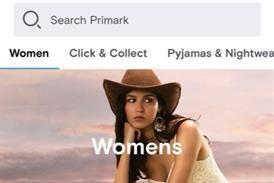
All retail websites look pretty much the same, don’t they? Grid format, with products displayed in clickable squares. Is this similarity a good thing for shoppers?

When Jeff Bezos talks, retail tends to listen – even more so when the Amazon boss is putting his money where his mouth is.

So Bezos’ investment, via venture capital fund Village Global – which also counts Bill Gates and Mark Zuckerberg in its ranks – in tech firm Obsess is worth examining.

Obsess acquired the pre-seed funding from Bezos and co last year but launched last month. Its mission is to “turn online shopping into an experience and replace the monotonous grid ecomm interface that hasn’t changed since it was created by Amazon 25 years ago to sell books”.

“When it became viable to buy online, all ecommerce experiences became the same”

Anant Sharma, Matter of Form

Obsess’ augmented and virtual reality software platform enables brands and retailers to serve “360-degree shopping experiences” on websites, apps and social channels.

Compared to bricks and mortar retailers, ecommerce players have had it comparatively easy over the past two decades. 

While store retailers have been forced to up their game, creating experiential flagships and service-led hubs, the humble website may have been optimised, but the basic user experience has not dramatically changed since Amazon and Net-a-Porter first began building their online empires in the early 2000s.

Design agency Matter of Form group chief executive Anant Sharma says: “As people began to buy online, retailers began to look much more closely at how users flowed through ecommerce sites and we ended with common denominator Net-a-Porter-style websites. When it became viable to buy online, all ecommerce experiences became the same.”

Some – and Bezos’ investment in Obsess would indicate his inclusion – believe that the status quo is due for disruption. So, should retailers be rethinking their ecommerce approach? Or is innovation simply a distraction?

The status quo of web design

Most ecommerce websites are designed around a grid format, with products displayed in clickable squares, which then direct into product information and purchasing options. It’s a template that everyone from your 65-year-old mum to your five-year-old nephew is familiar with.

“The main argument for not going against the grain when it comes to approaching ecommerce is that the standard approach and ‘grid-layout’ has been thoroughly tested with a huge amount of real users,” says Jono Brain, co-founder of digital agency Anything, which has worked with brands including Netflix, Boots, Quorn and Lego.

“Many great minds, at many great companies, have worked to define the optimum approach to ecommerce looking at everything from website navigation to checkout process across devices. As a result, the typical user is so used to the layout and features seen on a typical ecommerce site that browsing and purchasing have become almost second nature to them.”

This familiarity can be a double-edged sword, however. As more retailers develop good ecommerce platforms, it can be harder to stand out among the crowd. “Now that the chasing pack has caught up, brands are looking for other ways to have an ‘edge’ over the competition,” Brain says.

Retailers doing things differently

That edge can come in a variety of forms, with arguably the most innovative and experimental ecommerce sites not coming from the head offices of the UK’s major retailers.

Instead, smaller players including Manchester ecommerce site Beauty Bay and New York media group Man Repeller, which developed a unique online experience around its small ecommerce operation this summer, have taken the lead.

Beauty Bay’s decision to split its customer traffic by the directives ‘shop’ and ‘discover’ allows customers to experience its website completely differently depending on their mission.

While all retailers recognise that customers come to their websites on both journeys, Beauty Bay’s decision to make that purpose explicit means it can more easily cater to customer needs with its ‘discover’ tab leading to editorial content including tutorials, interviews and blogs and its homepage ‘shop’ section allowing the user to scroll through highlighted products, all of which are clickable and go direct to product listing pages.

The set-up is reminiscent of a newspaper or magazine’s online page, with each product displayed as editorialised content replete with headlines and taglines, with users only making use of a conventional grid format via its menu side bar.

Man Repeller’s website also adopts a ‘shop’ section alongside one labelled ‘play’, but both sections are some of the most unconventional online shopping experiences on the internet.

The shop uses the grid format but very loosely, making it much less clearly defined than normal to create a relaxed impression while the supporting content fills the page and does not require the user to click through a gallery. The ‘play’ tab allows users to read content, interact with graphics by typing their answers to receive idiosyncratic ‘affirmations’ and personalised graphics, and even play a keyboard piano.

Headless ecommerce

Even if retailers baulk at moving away from the standard grid format, which consumers have become so accustomed to, they can still make their ecommerce platforms stand out. One of the most effective ways of doing so is to focus on content and branding, according to Anything account director Jonny Wilcox.

“Another way that brands have looked to differentiate from the competition is by focusing less on the hard-sell and more on the brand ethos and commitment,” he says. “Brands like Lush and Patagonia place just as much importance on the supporting content as they do the products on their sites.”

A new mode of ecommerce termed ‘headless’ ecommerce could help retailers make their content sing and their websites look much more individual.

“We believe that headless ecommerce is the future of ecommerce platforms”

Jono Brain, Anything

Headless ecommerce means that instead of an entire website sitting within one platform, the front end of the store (what the user sees) is separate from the nuts and bolts of the ecommerce function. This means it will be much easier to change the appearance of ecommerce websites.

“We believe that headless ecommerce is the future of ecommerce platforms,” Anything co-founder Jono Brain says. “This headless approach can solve a lot of limitations of the standard ecommerce platform, as the retailer can be in complete control of the look, functionality and even the URL structure of the website. Because of the flexibility afforded by this approach, new features can also be tested and rolled out quickly.

“A headless approach to ecommerce can be used to facilitate a content-focused approach. With content editors not having to focus on the look and feel of the site, they are free to rapidly create thought-provoking content.”

Other successful retailers are rethinking how they design their websites. Marketplace Wish.com, valued at $11.2bn, is visually led, rather than search led, inspired by Chinese websites rather than European established practice.

Wish senior vice-president of engineering Tarek Fahmy told Retail Week that this approach replicates the discovery element of shopping in stores.

He said: “In the physical world a lot of shopping happens in malls and people are looking to discover things they didn’t know existed. That’s especially true in categories like fashion and accessories. These ecommerce businesses were not doing for customers what they get in the physical world.”

Ted Baker has pushed the boundaries of web design and user experience even further, albeit for a PR-laden trial.

In 2015, the fashion retailer used high-resolution 360-degree panoramic photography to digitalise its Shoreditch store and allowed online shoppers to virtually walk through the store with each item clickable and purchasable.

This may be too futuristic for mainstream shoppers right now but it could signal how we may shop online in the future.

A note of caution

From splitting the user journey to VR shops, it’s clear that the scope for creativity is not what prevents UK retail giants from experimenting with their ecommerce journeys. The reality is there are fears around moving away from standard practice and damaging conversion rates, particularly at mass-market retailers.

Boohoo ecommerce director Andrew Thomson says: “There’s a lot to be said for conventional rules. I often equate it back to cars… design is important but ultimately all cars do the same thing.”

He says that a conventional format allows him to solve challenges effectively, especially on mobile, which now accounts for over half (51%) of online shopping, according to IMRG.

“If every website was drastically different, they would be incredibly difficult to use”

Andrew Thomson, Boohoo

He adds that the real advantage of all websites following a standard format is that there is no learning curve. “Again, it’s like driving a car – drive one car and you can drive any,” he says.

“If every website was drastically different, they would be incredibly difficult to use. Yes, the drawback is every site begins to look the same – but isn’t it the job of the brand to distinguish itself through imagery and tone of voice?”

However, Sharma argues that consumers have become desensitised to standard formats and urges retailers to be more creative.

“For me, there is a tension between branding and conversion,” he says. “People ultimately look at analytics and design around what converts the quickest. That is the conventional approach, but it tends to erode brand experience.

“And that’s fine for selling for tomorrow but you won’t have a brand in a few years’ time. Of course, it’s easier, when you have a digital director who wants to mitigate risk, to do what the numbers say.”

Ultimately, choosing whether to experiment with your online platform is a game of risk. But for retailers that want to stand out from the crowd and offer shoppers a unique online experience, it may be a gamble that could pay off.