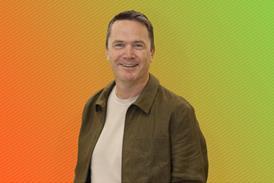
Gregory Roekens, Chief technology officer for Wunderman, shares his view of good and bad websites.

Good site: Starbucks.co.uk

Starbucks

Starbucks

Starbucks.co.uk Starbucks recently relaunched its website and the most important improvement is not immediately visible. To see the significance of this ‘invisible’ improvement, open the site in a browser and change the size of the browser from full screen to narrow screen.

What you’re seeing is ‘responsive web design’ at work. Responsive web design is the answer to the multi-device challenge and means brands can deliver the right experience to multiple devices from the same code-base.

The beauty of this technique is it is easy to implement on template-based websites, which most ecommerce sites are built upon.

Bad site: Caffenero.com

Caffè Nero

Caffè Nero

Caffenero.com Responsive web design is a new technique that is only starting to emerge on brand websites and Caffe Nero’s website offers a good example of why companies should immediately adopt this new approach.

Open the website on a smartphone and you will see a ‘stamp’ effect where the website is reduced to a very small image that forces users to pinch and zoom to see content.

As the user experience has only been designed for computers, it doesn’t take into account the ‘touch’ benefits of modern smartphones and tablets and has left Caffe Nero’s online presence lagging behind a key competitor.