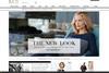
Marks & Spencer has launched its new ecommerce site, having spent two years moving from its Amazon platform. Rebecca Thomson takes a look.

Marks & Spencer has certainly thought carefully about how it communicates its new website to customers. Visitors are greeted by huge, eye-catching images shouting about the site’s new credentials, and are taken through to an introductory page. A quick, minute long video gives us testimonies from M&S’s clutch of celebrities, including Twiggy and Rosie Huntington-Whiteley, as well as from customers.

The design is clear and the site looks clean, and on a large screen it looks impressive. On a smaller laptop screen, however, it doesn’t work so well. It looks good on a mobile screen, but doesn’t have the same PR material pushing its newness.

The retailer has followed in the footsteps of Asos and Net-a-Porter by going for more of an editorial feel, meaning the site provides much more than a functional place to go shopping. Its Style and Living section is clearly designed to inspire, but it’s also easy to find product pages quickly if speed is of the essence. In the food section there are recipes, and the beauty section shows off its increasingly impressive selection of skincare brands nicely.

There is clearly a gap in the market for this sort of well-designed, editorially led content for M&S’s core older shoppers, but it will need to avoid competing too directly with the likes of Asos – these sites cater too well for their audiences for it to be easy for M&S to muscle in.