ManoMano has unveiled a radical rebrand as it bids to “differentiate” itself from its competitors.
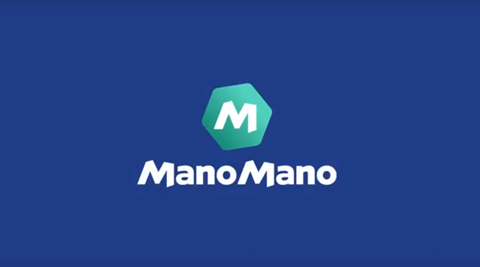
The France-based DIY and gardening etailer, which threw down the gauntlet to the likes of B&Q when it launched in the UK in 2016, has ushered in a new logo, font and pantone colours.
It forms part of ManoMano’s drive to highlight its “quirkiness, trustworthiness and its passion for fun”.
ManoMano stocks over two million products across its markets, which also include Spain, Italy and Germany. Some 200,000 of those are offered in the UK, making it the largest range of DIY and gardening products in Britain.
Almost two million shoppers across Europe now purchase products through its marketplace.
The rebrand comes following a period of strong growth for ManoMano, which has tripled revenues every year since 2013.
It ended 2017 with sales of €250m, buoyed by strong performance in the UK, which “exceeded all the expectations” the business had.
ManoMano co-founder Philippe de Chanville said: “We’ve come a long way in five years so it’s only right that we update the look of ManoMano so that it’s in line with what we’re all about – creating more love in this DIY world.
“Our aim is to inspire our customers, partners, fans, staff and we want to be the driving force behind the expansion of the DIY community across Europe with our messages of unity and encouragement.
“Breaking down barriers in the DIY sector and being a disruptor is our aim. ManoMano is not just about selling drills at a decent price, our aim is to be a brand, not just a marketplace.”







No comments yet